
Mobile-Responsive Design — Your Website, Perfect on Every Screen
📋 What's on This Page — Jump Directly To:
Is Your Website Losing Customers Right Now — Without You Even Knowing?
Here is a fact that most business owners don't realize: over 60% of all web traffic comes from mobile phones. That means more than half of the people visiting your website right now are viewing it on a small screen — and if your site is not built to handle that, they are leaving within seconds.
A website that looks great on a desktop but breaks on a phone is not just a design problem — it is a revenue problem. Every visitor who gets a frustrating mobile experience is a potential customer you just lost to a competitor. We fix that. We build websites that work beautifully on every device, every screen size, every time.
📱 Why Mobile-Responsive Design Is No Longer Optional
Some business owners still think of mobile optimization as a bonus feature. In 2024, it is a basic requirement — and here is why:
- ❌ Google penalizes non-mobile websites — if your site is not mobile-friendly, it ranks lower in search results, meaning fewer people find you
- ❌ Visitors leave immediately — 53% of mobile users abandon a site if it takes more than 3 seconds to load or looks broken on their phone
- ❌ You look unprofessional — a site that is difficult to navigate on mobile signals to customers that you don't care about their experience
- ❌ You lose sales directly — if a customer cannot easily tap a button, fill a form, or read your content on their phone, they simply won't
- ❌ Your competitors are already mobile-ready — every customer you lose goes somewhere else that works on their phone
The good news? All of this is completely fixable — and that is exactly what we do.
⚙️ What We Do For Your Website
We do not just resize your existing website and call it mobile-friendly. We build or rebuild your site with a mobile-first approach — which means we design for the smallest screen first, then scale up to tablets and desktops. The result is a seamless experience everywhere.
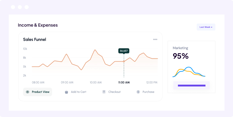
- 📐 Fluid Grid Layouts — Your website layout automatically adjusts and reflows based on the screen size. No squished content, no horizontal scrolling, no overlapping elements — everything fits perfectly.
- 🖼️ Responsive Images & Media — Images and videos scale correctly across all screen sizes without pixelating or overflowing. We also optimize file sizes so your site loads fast on mobile data connections.
- 👆 Touch-Friendly Navigation — Buttons, menus, and links are designed for fingers, not mouse cursors. Large tap targets, easy-to-use hamburger menus, and smooth scrolling for a native app-like feel.
- ⚡ Mobile Speed Optimization — We compress images, minify code, and use modern techniques to make your site load in under 3 seconds even on slower mobile connections.
- 🔤 Readable Typography on Every Screen — Font sizes, line spacing, and text contrast are carefully set so your content is easy and comfortable to read on any device without zooming in.
- 🧪 Cross-Device Testing — We test your website on real devices — iPhones, Android phones, iPads, and various desktop screen sizes — before we hand anything over to you.
🔧 How Responsive Design Actually Works
You might be wondering — how does one website show differently on different screens? The answer is something called CSS media queries. Think of it like smart instructions built into the website that say: "if the screen is this wide, show the layout this way — if it is smaller, show it that way."
For example, on a desktop your website might show a three-column layout with a large navigation bar. On a tablet, it shifts to two columns. On a phone, it becomes a single column with a compact hamburger menu. The content is the same — only the presentation changes to fit the screen.
This is not a workaround or a quick fix. It is the industry-standard, Google-approved method for building websites that work everywhere. And we build every site this way from the ground up.
✅ Everything That's Included in Our Service
No hidden charges, no surprises — here is everything you get when you work with us on your mobile-responsive website:
- Mobile-First Responsive Design
- Cross-Device & Cross-Browser Testing
- Touch-Friendly Navigation & Buttons
- Responsive Images & Video Embeds
- Mobile Page Speed Optimization
- Google Mobile-Friendly Compliance
- Readable Fonts & Proper Spacing
- Post-Launch Support & Revisions
🎯 Who Is This Service For?
If you have a website — or are planning to build one — this service is for you. Here are some common situations where we are brought in to help:
- 🏪 Small Business Owners — Your existing website was built years ago and looks outdated or broken on modern smartphones
- 🛍️ Online Store Owners — Customers are visiting your store on their phones but leaving without buying because checkout is difficult on mobile
- 🏥 Clinics, Salons & Service Providers — People search for your services on their phones — if your site is hard to use, they call your competitor instead
- 🏗️ New Businesses — You are launching a brand new website and want it done right from day one — mobile-ready, fast, and professional
- 📊 Businesses Running Ads — You are spending money on Google or Facebook ads but your landing page does not convert on mobile — we fix that
- 🎨 Freelancers & Portfolios — Your portfolio or personal brand site needs to impress potential clients on any device they use
If any of these sound familiar — we are exactly who you need.
💡 3 Free Tips — Make Your Website Better on Mobile Right Now
We believe in helping you succeed whether you work with us or not. Here are three things you can check today to improve your mobile experience:
- 💡 Tip 1 — Test Your Site Right Now. Open Google's free tool called Google Mobile-Friendly Test and enter your website URL. It will tell you in seconds whether Google considers your site mobile-friendly and highlight specific problems that need fixing. This is the same test Google uses when deciding your search ranking.
- 💡 Tip 2 — Make Your Call-to-Action Button Impossible to Miss. On mobile, your most important button — whether it says "Call Now," "Book Appointment," or "Shop Now" — should be large, clearly visible, and easy to tap with a thumb. If a visitor has to zoom in or scroll to find it, you are losing conversions every single day.
- 💡 Tip 3 — Compress Your Images Before Uploading. Large, uncompressed image files are the number one reason websites load slowly on mobile. Use a free tool like TinyPNG to reduce your image file sizes before uploading them — you can often cut the size by 60-80% with no visible quality loss. Faster loading means fewer people leaving your site before it even appears.
📈 Real Results You Can Expect From a Mobile-Ready Website
When your website is properly optimized for mobile, the impact is measurable and immediate. Here is what our clients typically experience:
- 🚀 Lower Bounce Rate — Visitors who get a good mobile experience stay longer, read more, and are far more likely to take action
- 🔍 Higher Google Rankings — Google's algorithm prioritizes mobile-friendly sites — a responsive redesign directly improves your search visibility
- 📱 More Leads & Inquiries From Phone Users — When your contact form, phone number, and booking system work smoothly on mobile, people actually use them
- 💳 Better Sales Conversion on Mobile Devices — For e-commerce sites, a smooth mobile checkout experience significantly increases the number of completed purchases
- ⭐ Improved Brand Perception — A clean, fast, professional mobile experience tells customers that your business is modern, trustworthy, and worth their time
🚀 Ready to Make Your Website Work on Every Device?
Every day your website is not mobile-friendly is another day you are losing visitors, rankings, and revenue. The fix is straightforward — and we make the whole process easy for you. You don't need to understand the technical side. Just tell us what you need, and we handle everything.
📞 WhatsApp Us Now: +1 403-975-9222
💬 FREE Mobile Review — We will look at your current website,
identify exactly what needs fixing on mobile, and give you a clear,
honest recommendation. No pressure, no sales pitch — just real advice.
📧 Email: info@yycmarketingca.com
🌐 Website: Contact Us
🎁 Special Offer: Book your free consultation this week and receive 15% OFF your mobile-responsive design project!